

Using your FireBoard
FireBoard Analyze Answers the Question: “When Will Dinner Be Ready?”
Today FireBoard is releasing a major new feature called FireBoard Analyze™ on its mobile app that gives users a new way to examine and track their cooks.

Ted Smoking a pork shoulder to beta test the new features on the FireBoard app.
FireBoard Analyze™ currently includes two main functions, Predictive Analysis and Session Comparison. Predictive Analysis will project and estimate/predict when a cook should be complete. This will be useful in various aspects of meal preparation, including an answer to the eternal question: “When is dinner going to be ready?”

New to the FireBoard App, tap the Analyze icon to start either Predictive or Comparison analysis. Giving users a sense of the pace of their cook in either type of analysis, the rate of temperature change is displayed above the graph, showing both the last hour and last five minutes of temperature changes.
The second tool, Session Comparison, allows users to compare a past cook with an active one. Both are currently available, via the new Analysis tab found at the bottom of the FireBoard app’s Dashboard.

FireBoard Analyze™ helps users improve their cooks, just like Burnt Finger’s award-winning brisket!
Predictive Analysis offers Linear and S-curve graphing
Predictive Analysis is based on a target temperature that you set. Calculations are made continuously throughout your cook, giving you a fresh estimate of when you reach your desired temperature.

Screenshots of Steven’s test brisket. The S-Curve of Predictive Analysis changes in real-time to give the user an accurate estimation of when their target temperature will be reached.
The tool also lets you toggle between the predictive S-curve and a Linear graph view. The Linear is simply a straight line between your current temp and the temp you want to end at. This would be useful to see where your cook would go if you lived in a perfect world. The S-Curve is an ever-changing representation of when your meat will reach that temperature.

The Analyze feature allows users to toggle between a predictive S-Curve and a straight line graph, estimating the time until a certain temperature will be reached. In linear view, the user can set what time frame to grab temperature data from to calculate the end time. Accomplished by tapping and dragging the gray shaded area of the graph, notice the difference between end estimates of the two examples center and right.
Session Comparison
An additional real-time cooking tool that FireBoard is rolling out today is called Session Comparison. This handy tool lets users overlay a previous cook with an active one in real time. This allows users to compare and contrast a successful cook from the past with a present session.

Use “Choose a session” to select what past session to compare a current cook to. Once selected use “Offset Adjust” to align the past cook with current.

The new Analyze feature on FireBoards App helps cooks manage their time, by giving them real time estimates of when their meat will reach a desired temperature.

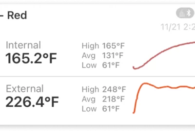
Screenshots of Ted’s pork shoulder using Session Comparison. The temperature graph of the past cook is shown in gray, while the active cook is shown in orange.
This new addition to the app is available to FireBoard users free of charge, as part of their next App update, and will be visible as a new tab labeled “Analyze” on the app’s dashboard. Download the app today for both Android and iOS.


About Author
Jeff Nichols
Related posts

Apps, Tech, Using your FireBoard
The Story Behind Our New Wireless Food Probe
For barbecue enthusiasts and anyone seeking pinpoint temperature control, FireBoard has long been a trusted name. Now, with the launch of the new FireBoard Pulse, a first-of-its-kind dual-band wireless food probe, we’ve set the bar even higher.
Apps, Tech, Using your FireBoard
New Year, New Mobile App Upgrades
The holidays are here, and what better way to celebrate than with the gift of precision and control in the kitchen, at the grill, or on the job? Check out this year’s FireBoard holiday gift guide.

Company News, Manufacturing, Tech, Using your FireBoard
Meet the New Drive Blower G3, Available Now
Today, we’re excited to share details about the all-new Drive Blower G3, an upgraded version of our Drive Blower model. This new blower features significant improvements in both design and functionality.

Company News, Manufacturing, Tech, Using your FireBoard
Are You Making the Most of FireBoard Analyze™?
Analyze™ offers unique ways to improve your cooking by predicting temperature trends and comparing your hard work against your past self.
Tech, Using your FireBoard
September 2024 Patch Notes
Today we’ll be sharing our patch notes for the most recent major firmware update to the FireBoard 2 series: Version 4.0.0.
Leave a reply